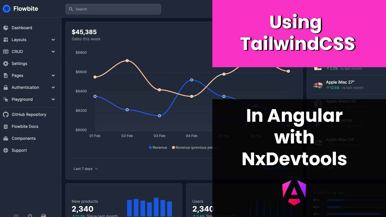
Using tailwind in Angular with nx
 Written by
Brecht Billiet
Written by
Brecht Billiet
Intro
I love software development, I love building applications, components, more complex stuff, etc… I started out as a web developer at the age of 16, turned into a software architect later on my road. I’ve been writing CSS since the beginning, but that doesn’t necessarily mean I still love doing it:
I rather focus on the software part. When I do consultancy for big clients, the design is mostly thought out by a separate team, and we just have to rebuild the components pixel perfect. My CSS skills are good enough to convert a figma design, but for my own projects I don’t have time and I want to focus on what I love: Building cool applications!
I’m currently working on a boilerplate product that will contain best practices, real code, state management, complex forms, in a big scalable Nx devtools architecture. I want to focus time on cool things like:
- Supabase integration
- Data fetching strategies with optimised state management
- Removing boilerplate and redundancy
- Loading state
- Error handling
- Calendar integrations
- …
The problem is, I also want a sexy design, that is mobile friendly and has a high focus on UX. For that I needed an UI solution. I thought about Bootstrap, PrimeNG, writing something custom myself,… so I asked my friends on X for advice:
Tweet Link
I was quite surprised that a lot of people were suggesting TailwindCSS. Tailwind is just a way of writing CSS right?! Well actually it’s more than that:
- It’s also a grid system
- It’s easy to create responsive designs
- It’s super opinionated
- It has and efficient bundle size
- It has a lot of free templates out there
- It has cool plugins
- It supports dark/light themes out of the box
It’s actually becoming one of the standards in web-development. This means there are a lot of templates out there, and also a few paid solutions. Finding tailwind developers shouldn’t be hard either.
Tailwind in a nutshell
So, with tailwind you don’t write CSS anymore, you add tailwind classes directly to your DOM elements.
Whaaaaat?! Are we seriously going back to writing CSS in the templates? That sounds like a crazy idea, right?!
And what about the extremely clean encapsulation rules of Angular components in terms of CSS?!
Well You could still do that, bear with me… There are multiple ways of using tailwind with Angular, but we’ll tackle that later.
The biggest selling points for using tailwind for me:
- I can copy paste tailwind styles from existing templates in my DOM and I create styled components in no-time.
- It forces me to create small reusable components. My Tailwind styles are abstracted behind my components, so in my smart components there is hardly any CSS, or Tailwind classes.
- It works really great with Angular selectors and content projection.
This is how you would create a button with Tailwind CSS:
<button class="focus:outline-none text-white bg-blue-700 hover:bg-blue-800 focus:ring-4 focus:ring-blue-300 font-medium rounded-lg text-sm px-5 py-2.5 me-2 mb-2 dark:bg-blue-600 dark:hover:bg-blue-700 dark:focus:ring-blue-800">Hi</button>
What if we would have default, alternative, dark, light, green, red, yellow, purple variations of this button?
That would result in a lot of redundancy, right?! We would rather use it like this:
<button>Default</button>
<button buttonType="alternative">Alternative</button>
<button buttonType="dark">Dark</button>
<button buttonType="light">Light</button>
<button buttonType="green">Green</button>
<button buttonType="red">Red</button>
<button buttonType="yellow">Yellow</button>
<button buttonType="purple">Purple</button>
This seems clean enough, in my template.
We could create an Angular component for that.
The button is mapped to a ButtonComponent that has Tailwind CSS behind the scenes:
@Component({
    selector: 'button',
    standalone: true,
    imports: [CommonModule],
    template: `
    <ng-content></ng-content>
    `,
    styleUrls: ['./button.ui-component.scss'],
})
export class ButtonUiComponent {
    @Input() buttonType: 'default' | 'alternative' | 'dark' | 'light' | 'green' | 'red' | 'yellow' | 'purple' = 'default';

    @HostBinding('class') get class() {
        switch (this.buttonType){
            case 'default':
                return 'focus:outline-none text-white bg-blue-700 hover:bg-blue-800 focus:ring-4 focus:ring-blue-300 font-medium rounded-lg text-sm px-5 py-2.5 me-2 mb-2 dark:bg-blue-600 dark:hover:bg-blue-700 dark:focus:ring-blue-800';
            case 'alternative':
                return 'py-2.5 px-5 me-2 mb-2 text-sm font-medium text-gray-900 focus:outline-none bg-white rounded-lg border border-gray-200 hover:bg-gray-100 hover:text-blue-700 focus:z-10 focus:ring-4 focus:ring-gray-200 dark:focus:ring-gray-700 dark:bg-gray-800 dark:text-gray-400 dark:border-gray-600 dark:hover:text-white dark:hover:bg-gray-700';
            case 'dark':
                return 'text-white bg-gray-800 hover:bg-gray-900 focus:outline-none focus:ring-4 focus:ring-gray-300 font-medium rounded-lg text-sm px-5 py-2.5 me-2 mb-2 dark:bg-gray-800 dark:hover:bg-gray-700 dark:focus:ring-gray-700 dark:border-gray-700';
            case 'light':
                return 'text-gray-900 bg-white border border-gray-300 focus:outline-none hover:bg-gray-100 focus:ring-4 focus:ring-gray-200 font-medium rounded-lg text-sm px-5 py-2.5 me-2 mb-2 dark:bg-gray-800 dark:text-white dark:border-gray-600 dark:hover:bg-gray-700 dark:hover:border-gray-600 dark:focus:ring-gray-700';
            case 'green':
                return 'focus:outline-none text-white bg-green-700 hover:bg-green-800 focus:ring-4 focus:ring-green-300 font-medium rounded-lg text-sm px-5 py-2.5 me-2 mb-2 dark:bg-green-600 dark:hover:bg-green-700 dark:focus:ring-green-800';
            case 'red':
                return 'focus:outline-none text-white bg-red-700 hover:bg-red-800 focus:ring-4 focus:ring-red-300 font-medium rounded-lg text-sm px-5 py-2.5 me-2 mb-2 dark:bg-red-600 dark:hover:bg-red-700 dark:focus:ring-red-900';
            case 'yellow':
                return 'focus:outline-none text-white bg-yellow-400 hover:bg-yellow-500 focus:ring-4 focus:ring-yellow-300 font-medium rounded-lg text-sm px-5 py-2.5 me-2 mb-2 dark:focus:ring-yellow-900';
            case 'purple':
                return 'focus:outline-none text-white bg-purple-700 hover:bg-purple-800 focus:ring-4 focus:ring-purple-300 font-medium rounded-lg text-sm px-5 py-2.5 mb-2 dark:bg-purple-600 dark:hover:bg-purple-700 dark:focus:ring-purple-900';
            default:
                return '';
        }
    }
}
You could say that the ButtonComponent looks weird, but it is a highly reusable and configurable component, and that’s a fact.
Besides the component is in charge of its styles, does it really matter that styles live in a separate scss file?
Once your button is designed, I can use it in a very clean way in my templates.
Also, I dit not wrote that stuff myself, I copied it from a Tailwind template library called Flowbite that has a clean design and is opinionated.
Being lazy as I am, I even asked ChatGPT to convert it to a HostBinding property for me. I created this component in seconds, and the Flowbite team has thought a lot about the different colors, so why should I?
Remember, I’m not a designer, and I’m lazy, and I don’t know tailwind, but I’m pretty sure if I change text-white to text-blue that the text color of my button would change.
Now how do I want my templates to look if I don’t want redundancy, or shattered CSS classes everywhere in my templates? Take this example for instance:
<simplified-base-layout-crud-list>
    <ng-container simplified-base-layout-crud-list-title>
        All ideas
    </ng-container>
    <ng-container simplified-base-layout-crud-list-table>
        <table>
            <thead>
            <tr>
                <th>Name</th>
                <th>Channel</th>
                <th></th>
            </tr>
            </thead>
            <tbody>
            <tr *ngFor="let item of vm.items; trackBy: tracker">
                <td>
                    {{item.name}}
                </td>
                <td>
                    {{item.channel?.name}}
                </td>
                <td>
                    <button [routerLink]="item.id">Edit</button>
                </td>
            </tr>
            <tr *ngIf="vm.items.length === 0">
                <td colspan="3">No ideas added yet</td>
            </tr>
            </tbody>
        </table>
    </ng-container>
</simplified-base-layout-crud-list>
<router-outlet></router-outlet>
The entire page is styled by components that use content projection. No CSS classes, no Tailwind CSS, all that stuff is in reusable components. We could use the selector of the DOM element to style it. However I think it’s a best practice to create a clean selector so we can add additional inputs and logic when needed. Here is the updated version:
<simplified-base-layout-crud-list>
    <ng-container simplified-base-layout-crud-list-title>
        All ideas
    </ng-container>
    <ng-container simplified-base-layout-crud-list-table>
        <table simplified-table>
            <thead simplified-thead>
            <tr simplified-tr>
                <th simplified-th>Name</th>
                <th simplified-th>Channel</th>
                <th simplified-th></th>
            </tr>
            </thead>
            <tbody simplified-tbody>
            <tr  simplified-tr *ngFor="let item of vm.items; trackBy: tracker">
                <td simplified-td>
                    {{item.name}}
                </td>
                <td simplified-td>
                    {{item.channel?.name}}
                </td>
                <td simplified-td>
                    <button [routerLink]="item.id">Edit</button>
                </td>
            </tr>
            <tr simplified-tr *ngIf="vm.items.length === 0">
                <td simplified-td colspan="3">No ideas added yet</td>
            </tr>
            </tbody>
        </table>
    </ng-container>
</simplified-base-layout-crud-list>
<router-outlet></router-outlet>
If that seems like to much work, you can just use the DOM selectors but this approach makes it a bit
safer. This approach also makes it super easy to create an interactive table.
(We could communicate between simplified-table and simplified-row elements for instance.)
Looking for templates
Now I do not want to write CSS, because I’m lazy right?! And I definitely don’t want to spent time learning all the classes of TailwindCSS. I rather learn as I go, and focus on building and shipping. The tweet I mentioned before suggested Tailwind UI.
First I was amazed by the simple and clean design of Tailwind UI and I went ahead and purchased the templates. However, I quickly realised that I would never be able to sell my codebase or opensource parts of it. I could sell a product as a SAAS, but I couldn’t sell the codebase, which is something that I want to do in terms of learning material or starter projects where everything is wired.
Flowbite
When googling for “Free tailwind templates”, I quickly stumbled upon this beautifull FREE admin template. Turned out this is part of a Flowbite design. Flowbite is a library that created a set of beautiful components for us based on Tailwind CSS. They have paid templates, but also tons of free components. They are:
- Beautiful
- Mobile friendly
- Support light and dark themes out of the box!
- Accessible
It has free dropdowns, buttons, badges, drawers, modals, tables, forms, etc… And it’s just Tailwind CSS behind the scenes so it’s totally framework agnostic.
This is ideal for people that want to ship fast, create SAAS business etc. There is a repo for Angular integration out there, but I wouldn’t advise to use libraries that have Angular dependencies, unless we really need to. After all, updating to new versions of Angular can be really painful, if we have a lot of these dependencies.
The combination of the free admin panel (there are other ones too, that are open-source) in combination with the components set is more than enough to build super awesome Angular applications without really having to know TailwindCSS. Take a look at their beautiful forms components for instance. I started using Flowbite with Tailwind CSS in Angular, and Nx and I’m shipping like crazy!🚀
Let’s start building
I am using this awesome tech stack:
- Nx devtools for making our software scale
- Angular as an opinionated, powerful, fast software framework
- Tailwind as a css solution
- Flowbite where we can copy-paste styles from
- Opinionated forms.
- Supabase as a Backend as a service, which saves me tons and tons of time
Let’s start building!
I use Nx devtools for all my projects since Angular 4, so let’s spin up an Nx workspace with the command:
npx create-nx-workspace@17.1.3 my-awesome-workspace
Prompt: ? Which stack do you want to use? …
- None: Configures a TypeScript/JavaScript project with minimal structure.
- React: Configures a React application with your framework of choice.
- Vue: Configures a Vue application with modern tooling.
- Angular: Configures a Angular application with modern tooling.
- Node: Configures a Node API application with your framework of choice.
Chose None, we want a clean slate.
Prompt:? Package-based monorepo, integrated monorepo, or standalone project? …
- Package-based Monorepo: Nx makes it fast, but lets you run things your way.
- Integrated Monorepo: Nx creates a monorepo that contains multiple projects.
- Standalone: Nx creates a single project and makes it fast.
Choose Integrated Monorepo. We want multiple projects in our architecture.
We can continue by installing @nx/angular and create an app with this command:
cd my-awesome-workspace && npm i @nx/angular@17.1.3 && npx nx g @nx/angular:app my-flowbite-app
Let’s add tailwind to this app:
npx nx g @nx/angular:setup-tailwind my-flowbite-app
This command will have installed TailwindCSS and added a tailwind.config.js file.
We can now install Flowbite and the forms package of tailwind with:
npm i flowbite && npm i @tailwindcss/forms
Let’s run the application by running:
npx nx run my-flowbite-app:serve
Now let’s go to the sidebar component and copy the code
from the first example and paste it in the my-flowbite-app/src/app/app.component.html file.
Now in my-flowbite-app/src/app/app.component.ts we need to init flowbite:
import { initFlowbite } from 'flowbite';
...
export class AppComponent implements OnInit{
    public ngOnInit(): void {
        initFlowbite();
    }
}
One last thing we need to do is we need to import the Flowbite javascript in the my-flowbite-app/tailwind.config.js file:
module.exports = {
    content: [
        "./node_modules/flowbite/**/*.js", // add this line
        ...
    ],
    ...
};
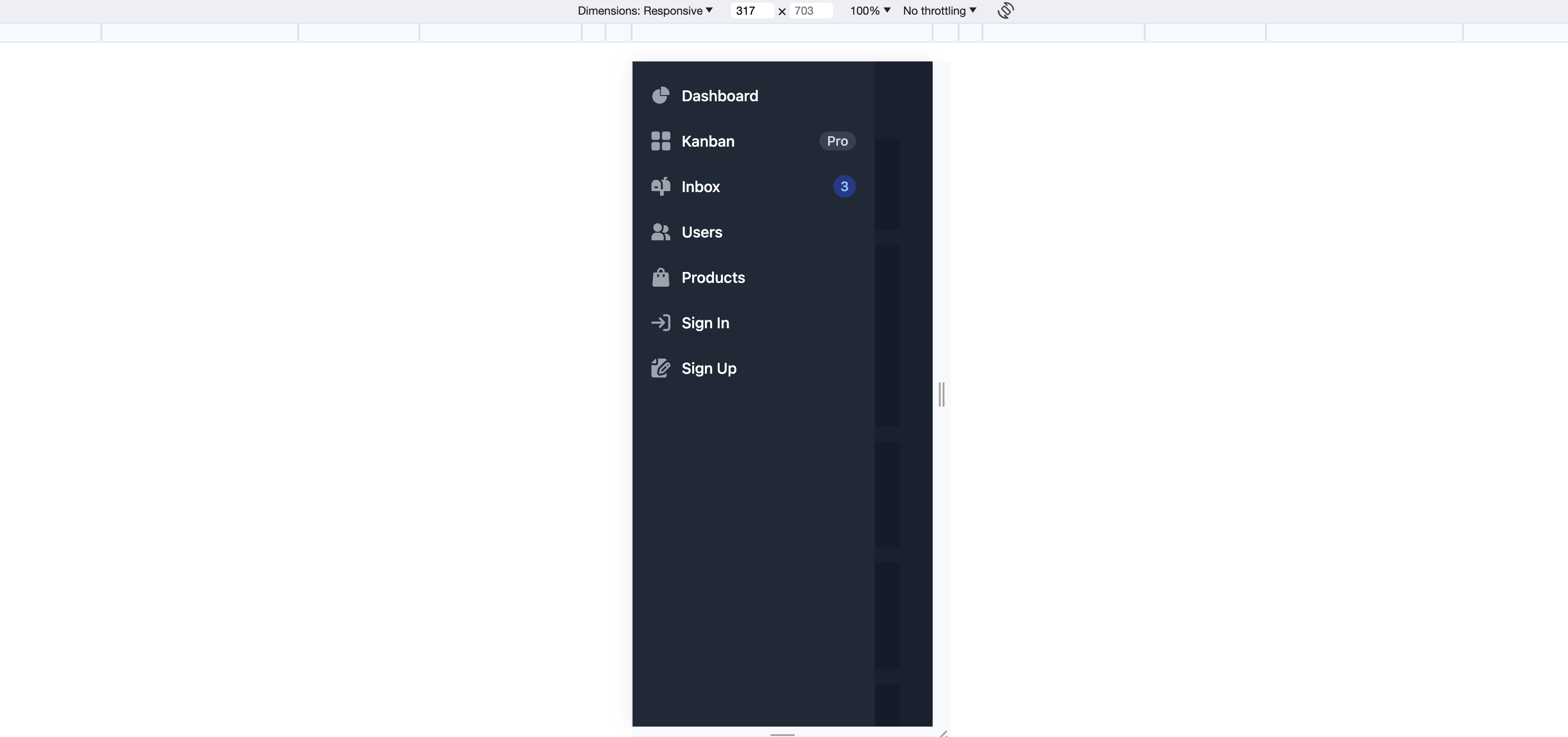
Now get your but over to http://localhost:4200 and witness the awesomeness! This is the desktop design, pretty awesome for 2 minutes work right?!
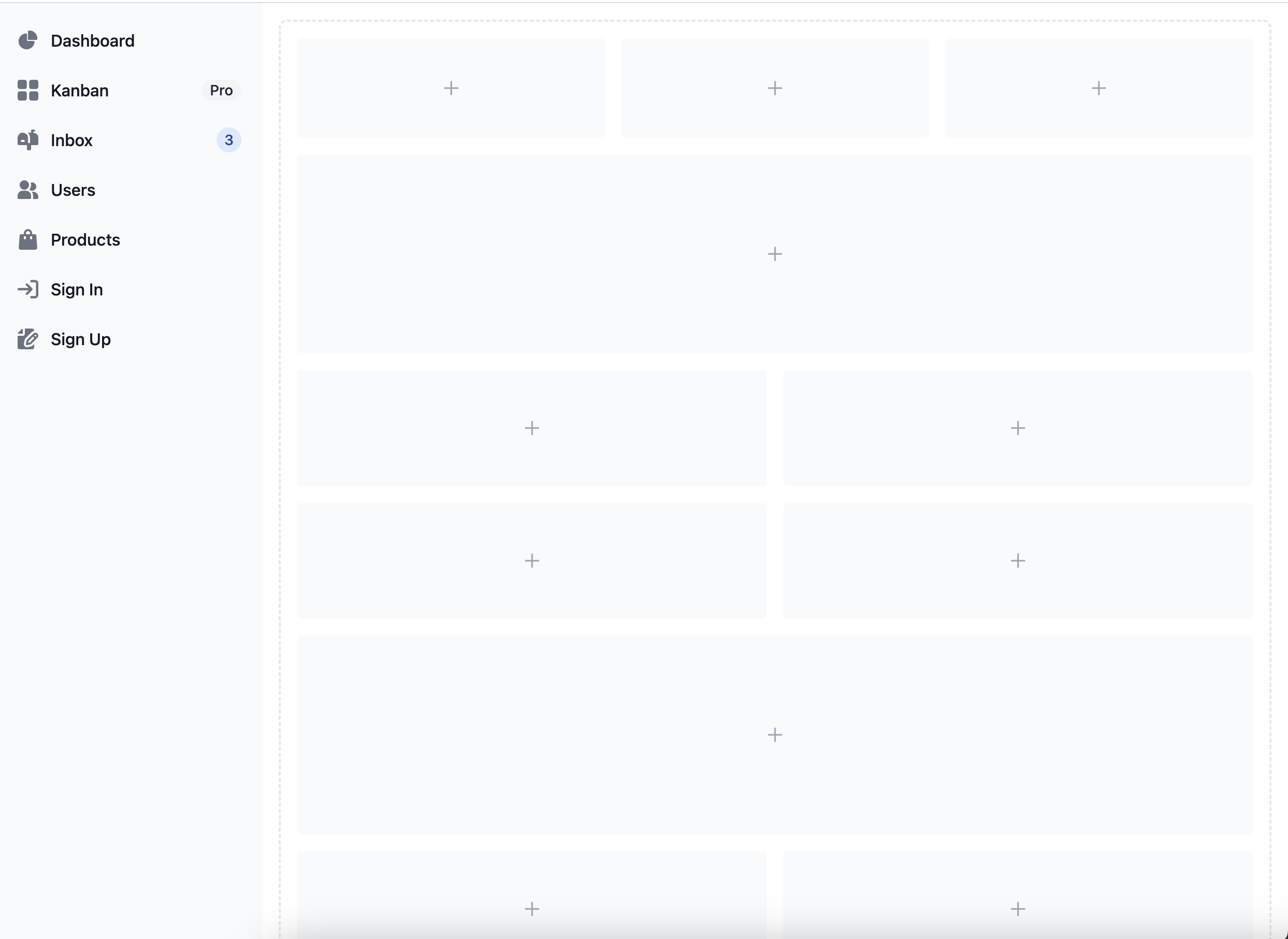
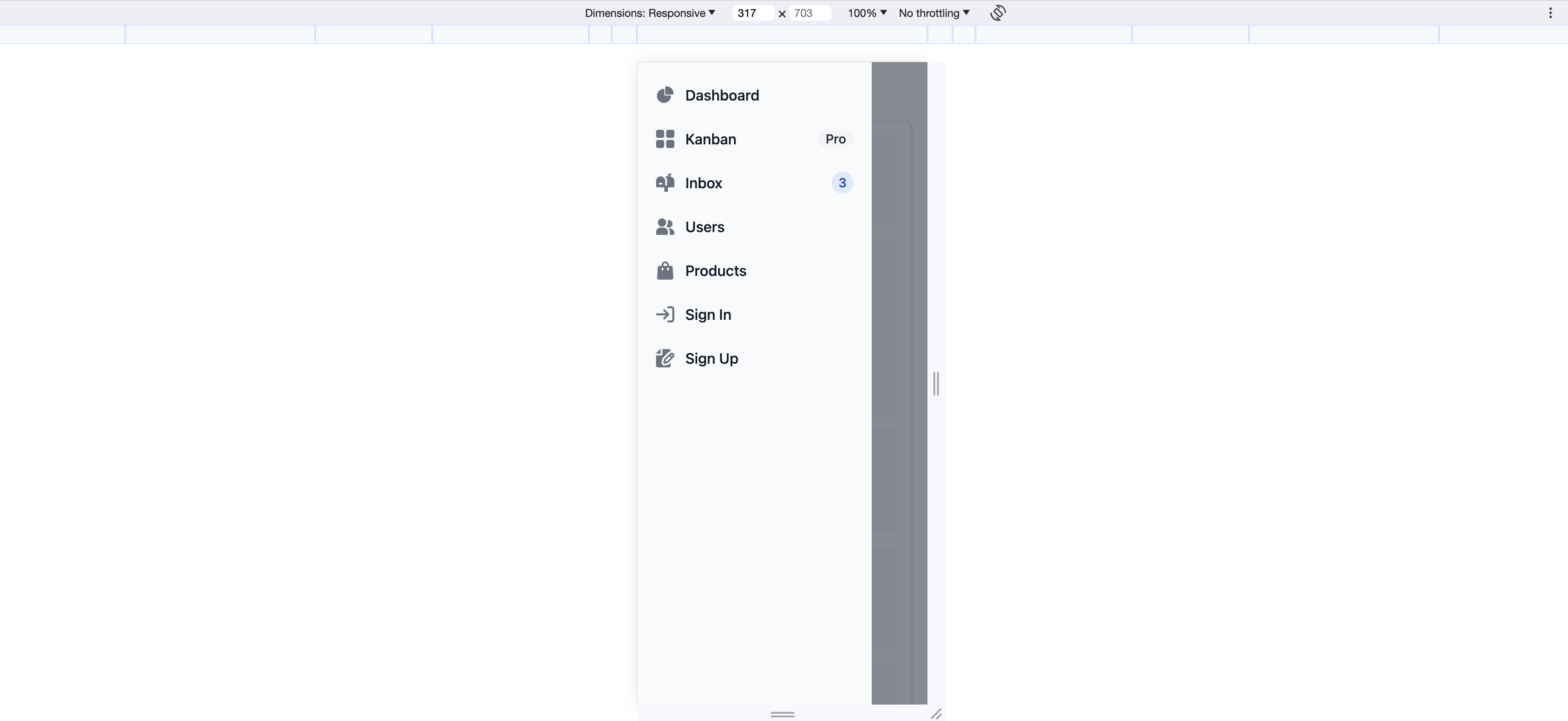
The mobile design is also pretty clean already:
Darkmode
It’s pretty easy to support darkmode as well.
In my-flowbite-app/src/index.html add the dark class on the html tag and add the dark:bg-gray-700
class on the body tag:
<!DOCTYPE html>
<html lang="en" class="dark">
  <head>
    <meta charset="utf-8" />
    <title>my-flowbite-app</title>
    <base href="/" />
    <meta name="viewport" content="width=device-width, initial-scale=1" />
    <link rel="icon" type="image/x-icon" href="favicon.ico" />
  </head>
  <body class="bg-gray-50 dark:bg-gray-700">
    <my-awesome-workspace-root></my-awesome-workspace-root>
  </body>
</html>
In my-flowbite-app/tailwind.config.js, add the darkMode property and set it to class:
module.exports = {
    content: [...,
    darkMode: 'class',
    ...
};
Jump back over to http://localhost:4200 and witness dark awesomeness!
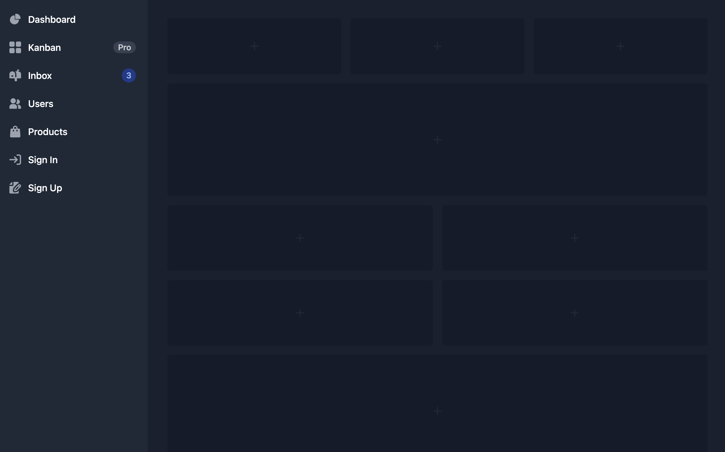
The mobile design is pretty cool:
Different ways of adding tailwind styles
Let’s create a button in our my-flowbite-app. Normally we want our apps to be empty shell and keep that stuff in libs
but for this demo we are going to break the rules:
npx nx g @nx/angular:component button --project=my-flowbite-app --standalone --skip-tests
We could use @apply in the scss file, but I had issues, with encapsulation. Even with encapsulation set to ViewEncapsulation.none
there were classes that worked and classes that didn’t. This approach worked best for me.
We can use a HostBinding in Angular to create different types of buttons.
export class ButtonComponent {
    @Input() public buttonType: 'default' | 'alternative' | 'dark' | 'light' | 'green' | 'red' | 'yellow' | 'purple' = 'default';
    @HostBinding('class') get class() {
        switch (this.buttonType) {
            case 'default':
                return `focus:outline-none text-white bg-blue-700 hover:bg-blue-800 focus:ring-4 focus:ring-blue-300 font-medium rounded-lg text-sm px-5 py-2.5 me-2 dark:bg-blue-600 dark:hover:bg-blue-700 dark:focus:ring-blue-800`;
            case 'alternative':
                return `py-2.5 px-5 me-2 text-sm font-medium text-gray-900 focus:outline-none bg-white rounded-lg border border-gray-200 hover:bg-gray-100 hover:text-blue-700 focus:z-10 focus:ring-4 focus:ring-gray-200 dark:focus:ring-gray-700 dark:bg-gray-800 dark:text-gray-400 dark:border-gray-600 dark:hover:text-white dark:hover:bg-gray-700`;
            case 'dark':
                return `text-white bg-gray-800 hover:bg-gray-900 focus:outline-none focus:ring-4 focus:ring-gray-300 font-medium rounded-lg text-sm px-5 py-2.5 me-2 dark:bg-gray-800 dark:hover:bg-gray-700 dark:focus:ring-gray-700 dark:border-gray-700`;
            case 'light':
                return `text-gray-900 bg-white border border-gray-300 focus:outline-none hover:bg-gray-100 focus:ring-4 focus:ring-gray-200 font-medium rounded-lg text-sm px-5 py-2.5 me-2 dark:bg-gray-800 dark:text-white dark:border-gray-600 dark:hover:bg-gray-700 dark:hover:border-gray-600 dark:focus:ring-gray-700`;
            case 'green':
                return `focus:outline-none text-white bg-green-700 hover:bg-green-800 focus:ring-4 focus:ring-green-300 font-medium rounded-lg text-sm px-5 py-2.5 me-2 dark:bg-green-600 dark:hover:bg-green-700 dark:focus:ring-green-800`;
            case 'red':
                return `focus:outline-none text-white bg-red-700 hover:bg-red-800 focus:ring-4 focus:ring-red-300 font-medium rounded-lg text-sm px-5 py-2.5 me-2 dark:bg-red-600 dark:hover:bg-red-700 dark:focus:ring-red-900`;
            case 'yellow':
                return `focus:outline-none text-white bg-yellow-400 hover:bg-yellow-500 focus:ring-4 focus:ring-yellow-300 font-medium rounded-lg text-sm px-5 py-2.5 me-2 dark:focus:ring-yellow-900`;
            case 'purple':
                return `focus:outline-none text-white bg-purple-700 hover:bg-purple-800 focus:ring-4 focus:ring-purple-300 font-medium rounded-lg text-sm px-5 py-2.5 dark:bg-purple-600 dark:hover:bg-purple-700 dark:focus:ring-purple-900`;
            default:
                return '';
        }
    }
}
We can now use them like this.
<button simplified-button>Hi there</button>
<button simplified-button buttonType="green">Hi there</button>
<button simplified-button buttonType="dark">Hi there</button>
<button simplified-button buttonType="red">Hi there</button>
Even though there is a lot of Tailwind CSS code (that we didn’t have to write ourselves) going on in the button component, The usage of that button is pretty clean. This also forces us to create small component.
Conclusion
Are you awesome at CSS? Are you a fantastic designer? Then you might not need something like Flowbite. Maybe you are more productive with plain SCSS without TailwindCSS and that’s amazing! However, the combination of the technologies mentioned before make me super productive and make me ship way faster.
Follow @TwitterDevJoin the club and get notified with new content
Get notified about our future blog articles by subscribing with the button below.
We won't send spam, unsubscribe whenever you want.
Update cookies preferences